
AI can make software run. It still can’t tell whether a human knows what to do with it.
One of the things I think AI-assisted code and vibe-coding need to pay a lot more attention to is an old, unglamorous idea from software design: usability.
I’ve spent years having this conversation with early-career developers. Now I’m having the same conversation with language models and the people prompting them, and it’s all my old pet peeves back again in new clothes: interfaces that don’t tell you what to do, tabs that don’t show which one is selected, contrast cranked up where nothing needed emphasizing, errors that get swallowed and vanish into nothing.
Here’s the problem: A model optimizes for whether the code runs and whether it matches the prompt. It doesn’t optimize for whether a person, dropped cold into the screen, knows what to click. Those are not the same thing, and the gap between them is exactly where usability lives.
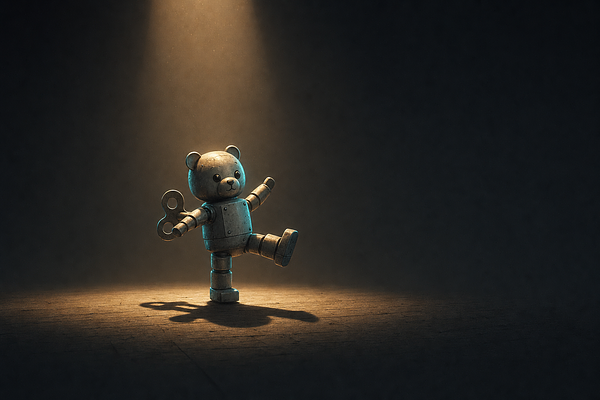
Alan Cooper had a name for why we let this slide: the dancing bear. Nobody’s impressed the bear dances well — they’re amazed it dances at all. Most software is dancing bearware. We forgive the clumsiness because the thing works at all. Vibe-coding is a whole zoo of dancing bears. You describe an app, and thirty seconds later an app exists, and the sheer fact that it exists is so impressive that nobody stops to ask whether it’s any good to use.
Somebody has to ask. That’s still a human job. So let me lay out a few of the rules — because while UX is subjective, it is not only subjective. Inside the subjectivity there’s a body of craft, thirty years deep, that you can actually learn and teach.
Jank
Purists reserve the word “jank” for dropped frames and layout shift — content that jumps around while the page loads. I use it more broadly, for the whole family of “that looks off” problems. Two buttons that should match, but one’s a few pixels wider. An element with more padding on the left than on the right. A row of things that don’t line up on any grid I can find. Individually, none of it is a bug. Nothing is broken. But your eye catches every misalignment before your brain can name it, and the cumulative message is this was not made with care.
AI coding produces jank constantly because it’s assembling markup that’s individually valid yet collectively sloppy. Alignment is a judgment call, and judgment is the thing you have to bring to the output.
Smallest effective difference
As Edward Tufte put it in Visual Explanations, the goal is to “make all visual distinctions as subtle as possible, but still clear and effective.” He called it the Occam’s razor of information design.
The instinct of an inexperienced designer — human or machine — is to make everything shout. Heavy borders, saturated colors, large drop shadows, five typefaces on one screen. Tufte’s point is that the difference only needs to be large enough to read. A faint rule does the work of a thick one. A slightly darker gray separates two regions as well as a hard black line does, and it doesn’t fight the content while it’s at it. When you land on a screen with jarring contrast that nobody asked for, that’s a violation of this rule. AI tools default to loud; restraint is something you have to request.
Signifiers and feedback
As Don Norman lays out in The Design of Everyday Things, two of the things that make anything usable are signifiers — the cues that tell you what you can do — and feedback — the system telling you what just happened. A flat metal plate on a door says “push”; a handle says “pull”. On a screen it’s the same contract. A tab that looks identical whether or not it’s selected is a control that took your click and then refused to tell you it worked. A link styled exactly like the text around it is a signifier that isn’t signifying. Norman calls the space between what the system did and what you can tell it did a gulf, and every unlabeled state, every button that looks the same before and after you press it, widens that gulf.
Models are fluent at generating controls and stingy about wiring up their states, because a screenshot of the resting screen looks finished. Selected, hovered, disabled, loading, error — those are the states nobody sees in a demo, and everybody hits in real use.
Self-evident design
As Steve Krug argued in Don’t Make Me Think, a screen should be self-evident: you shouldn’t have to work out what it is or how it wants to be used, it should just announce itself. He’s blunt about how people actually behave: they don’t read pages, they scan them. They don’t hunt for the “right” control, they grab the first thing that looks like it might work and muddle through. Every little “wait, what does this do?” is a tax, and enough of them and the person just leaves.
The failure Krug named is an interface which doesn’t immediately tell you what to do. And it’s a failure an LLM walks straight into, because “a competent person could eventually figure this out” is a bar it clears without trying — and it’s the wrong bar. The bar is: nobody should have to figure anything out.
Swallowed errors
This is the one that actually costs people. Something fails — a request times out, a field won’t validate, a save doesn’t save — and the interface says nothing. The error gets caught and dropped into a void. The user is left staring at a screen that looks fine and isn’t, with no idea what happened or what to do next.
In handwritten code, this comes from a lazy empty try {...} catch {...} block. In generated code it’s worse, because the model will happily write the happy path and quietly skip the failure states. Nothing in the prompt got graded on them, so why would it? Good software tells you when something went wrong, in plain language, and tells you what to do about it. That’s usability at its most basic, and it’s the first thing to disappear when everyone’s moving fast.
None of this is new. This is thirty years of settled craft, most of it written down before half the people vibe-coding today were out of school, and we’re speed-running right past it.
Why now
Here’s why I think this matters more than it did when Krug published Don’t Make Me Think in 2000. AI hasn’t made usability less important. It’s made it easier to skip.
We can now generate ten times the software surface we could a year ago, which means we can generate ten times the jank, ten times the swallowed errors, ten times the screens where a real person quietly gives up and closes the tab. The functional bar has collapsed — everyone can make it run now. So the bar that’s left, the one that separates software people tolerate from software people actually like, is the interaction. It’s the part the model doesn’t get graded on.
So grade it yourself. Put usability in the prompt, in the review, in the standard you hold the output to. The bear is going to keep dancing either way. Our job is to make it dance well.